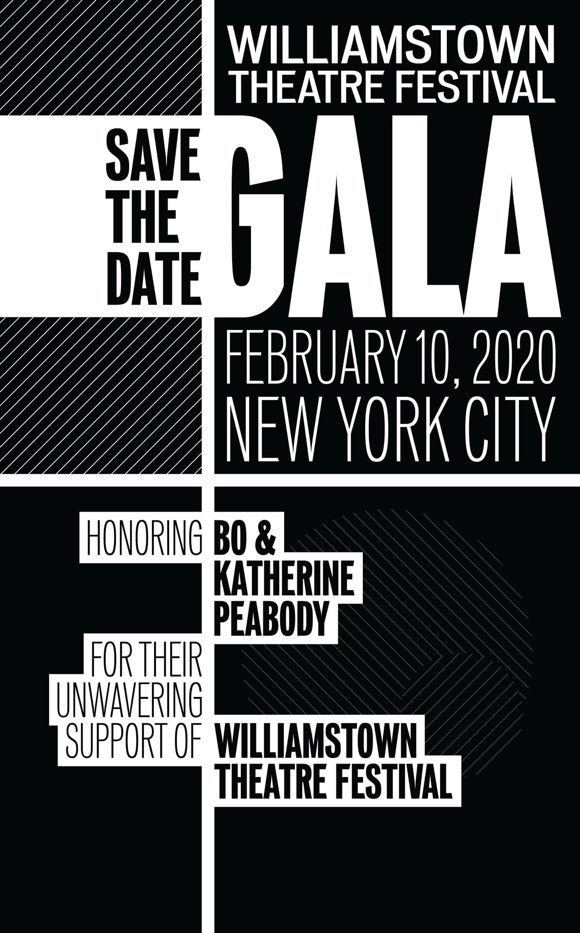
Save the date graphic

Invite

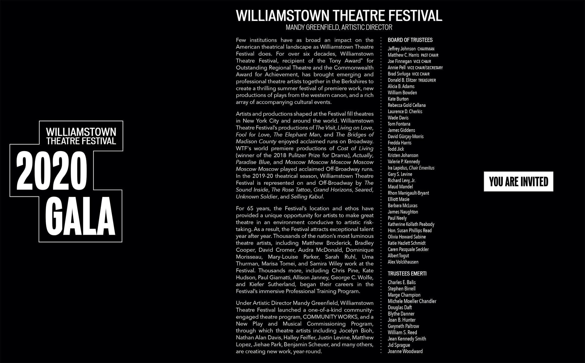
Invite exterior

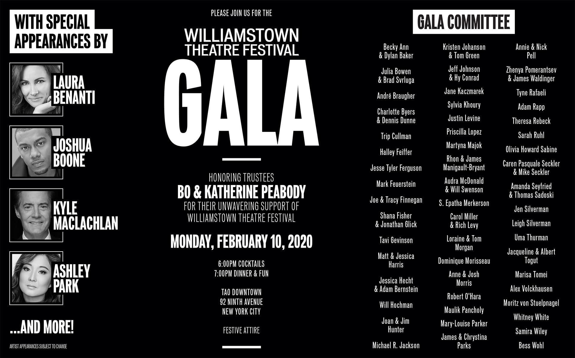
Invite interior
Williamstown Theatre Festival’s annual gala precedes the summer season by several months and serves to announce the upcoming shows to donors and patrons. We had not finished developing the season’s branding in time for the event, but I wanted to make sure the gala’s branding did not interfere with each show’s eventual key art. My solution was to use the company’s core typefaces set in a stark black-and-white palette with an extra emphasis on geometry and patterns. Using this aesthetic, I designed all gala materials including invites, marketing assets, and print collateral.
