

Wesleyan University, my alma mater, launched their new website during the Fall 2018 semester. This launch also featured a redesign of the school’s logo and monogram. Unfortunately, the community’s response to these changes was negative, with a particularly strong vocal pushback against the revised monogram. To address these concerns, the school retracted the monogram and opened up a design contest for yet another redesign.
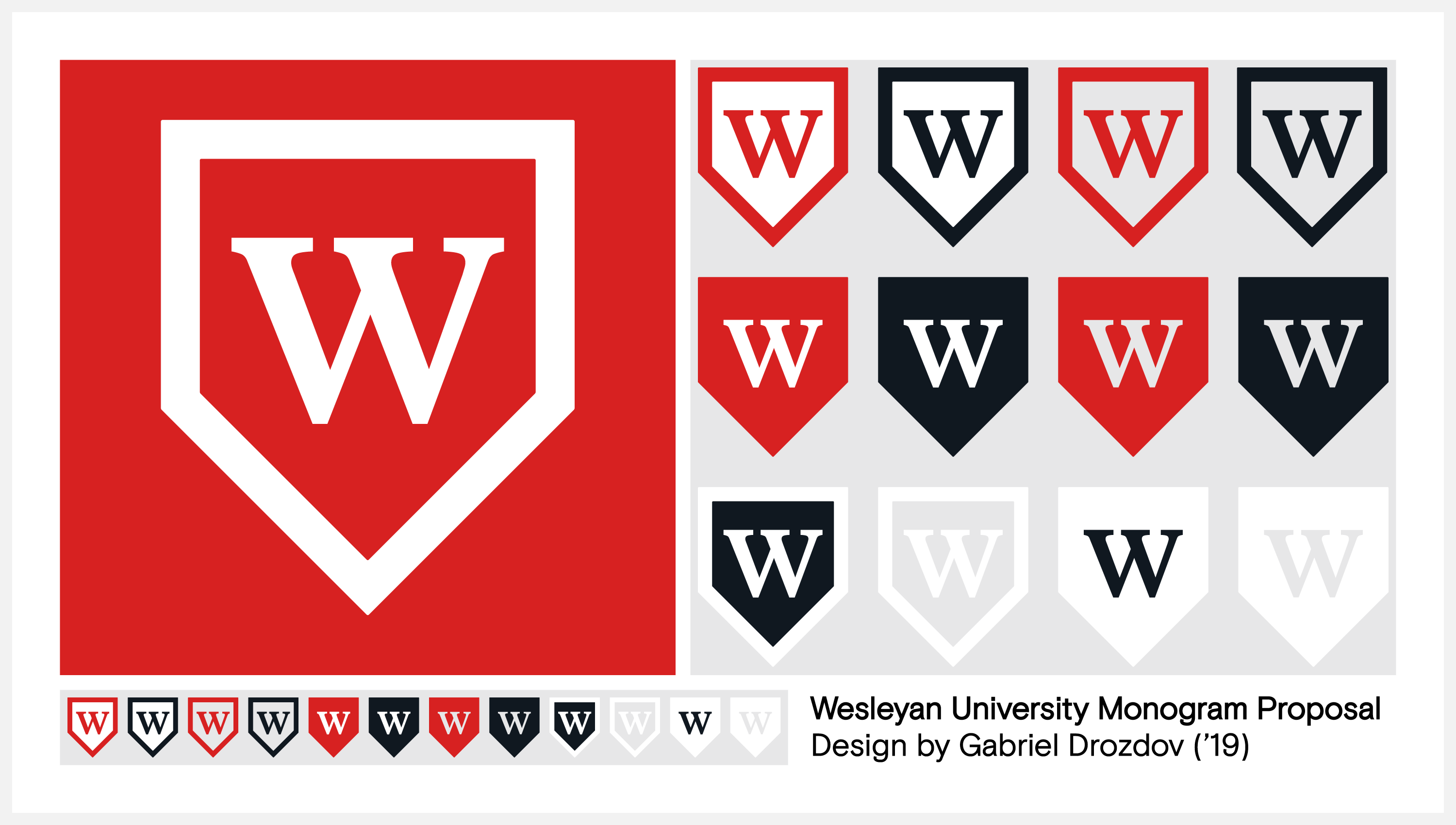
I entered this contest with a monogram inspired by Wesleyan’s full logo, which features a symbol evoking the school’s shield crest. The contest’s panel of judges selected my design as one of three finalists, and after a community poll my design came out on top with over 50% of 6,200 total votes. My monogram is now the official design used by the university across all official communications and merchandise.


